The Breadth Myth: What Market Data Really Says

One of the long-standing claims of technical analysis and of technical analysts is that poor breadth precedes and predicts a market crash. Countless books make this claim. This claim is even ensconced in the CMT curriculum, so social media is flooded with people making the same claim. It seems like a logical claim, but no one ever thinks to ask: Is it true? Turns out, not in any way that matters--not in 35 years of market data.
What is Breadth?
"The market" is not a monolith. It's convenient to speak in these terms: the market went up. What moves the market? How is the market today? But when we speak about "the market" we're actually talking about an average of many stocks. There are various indexes with different kinds and numbers of stocks in them, and different mathematical methods for calculating the average.
Breadth is a way of looking inside the average, to understand what is actually moving the numbers. "Good breadth" means that many stocks are supporting a move of the index, but it's also possible that a few stocks, or even a single stock in some extreme cases, has a big impact on the overall average.
What Does Breadth Tell Us?
You can find similar arguments in many technical analysis books, but the usual story is something like this: if a move is made on good breadth, it's probably real because many stocks are supporting it. On the other hand, if the indexes make new highs but do so on poor breadth, there's probably not "real buying" (whatever that means) behind the move and the move is more likely to fail.
This is often framed in the traditional concept of a divergence, where the market being tracked makes a new high but the indicator (in this case, breadth) does not make a new high. The language of technical analysis is coded with qualifiers such as "may", "can", or "sometimes". In rigorous cases, this type of wording is consistent with probabilities, but it can also hide sloppy thinking. If we're told a measure can mean a reversal is coming, a big advance, or nothing at all, how useful is this unless we are given tools to understand the actual probabilities behind the claim? (See, for instance, https://cmtassociation.org/technical_insights/technical-insights-april-2021/).
How to Measure Breadth
There are many ways to measure breadth, and it's probably useful to consider several measures together since our understanding of the phenomenon is going to be filtered through the particular definition we use. The Advance Decline line is a traditional measure that looks at the net of advancing versus declining stocks on any given day. From this simple concept, a number of variations grew, including the McClellan Oscillator which measures how a smoothed measure of breadth changes, and various computations that also consider volume in the calculation.
There is another class of breadth measures that looks at how many stocks are near their own 52 week highs, how many are above/below certain moving averages of their own prices, how many stocks have seen sudden shifts in their own volume or momentum--many people have considered this aspect of market behavior so quite a bit of work has been done on the topic.
For this study, I used a simple measure I've found useful: We take the price of each individual stock and calculate where it sits in its own 52 week range. This is PIYR (Price In Year's Range). In addition, I considered the following traditional measures:
- Percent of stocks above their own 200 day MA
- Percent of stocks above their own 50 day MA
- Percent of stocks within 5% of their own 52 week high
- Percent of stocks at 52 week highs minus the percent of stocks at 52 week lows
- The Advance Decline line's gap to its own 52 week high
- The percent of stocks that outperformed the S&P 500 over the previous 3 months
- The percent of stocks that outperformed the S&P 500 over the previous 6 months
- The 21 day average of up volume minus down volume shares
This is not a comprehensive list. You could undoubtedly suggest something I missed, but with a list this big, if there's an effect, we should find it. (And, with a large list, there's a high chance of a false positive and finding something that looks good, just by chance.)
What Happens When Index Highs are Made on Poor Breadth?
This is the question of the day, as the S&P 500 and Nasdaq indexes sit at all time highs, while the Dow Jones and Russell 2000 indexes are well off their highs, even leaning near-term bearish. The strength in the S&P 500 is clearly linked to the Nasdaq, which is driven by very strong performance of AI stocks. Many commentators presume we are in an AI bubble, and this is an emotionally-charged topic. These commentators often look for ammunition to support the bearish case, so this divergence raises some timely questions.
Historical perspective helps. The first point that should jump out is that much of the market's historical advance has happened on "poor breadth". Here's a look back to 1991, showing that a meaningful number of the markets' highs have come on poor breadth:
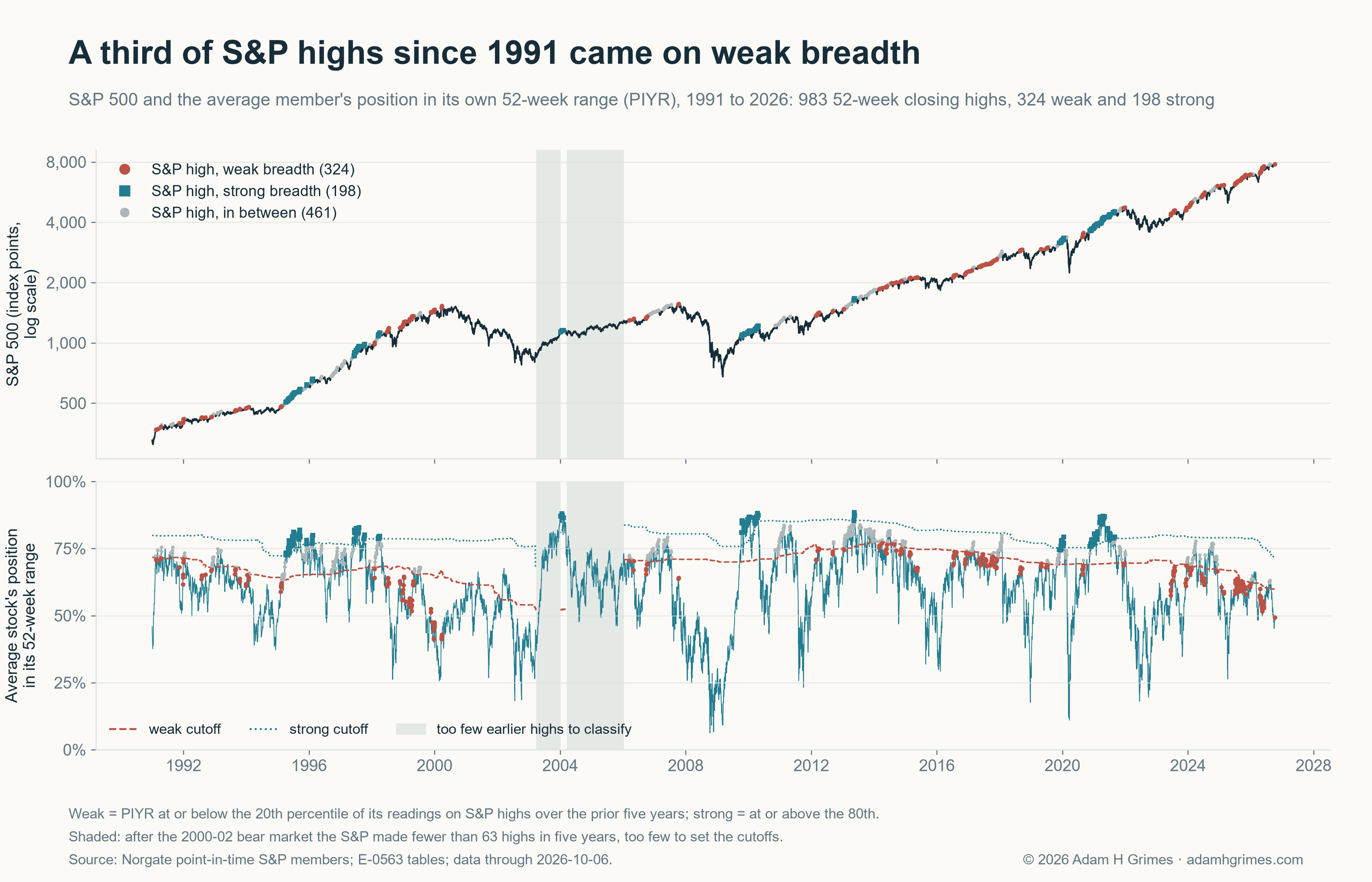
Such a long-term chart hides recent detail. Here's a similar chart that focuses on the past few years.
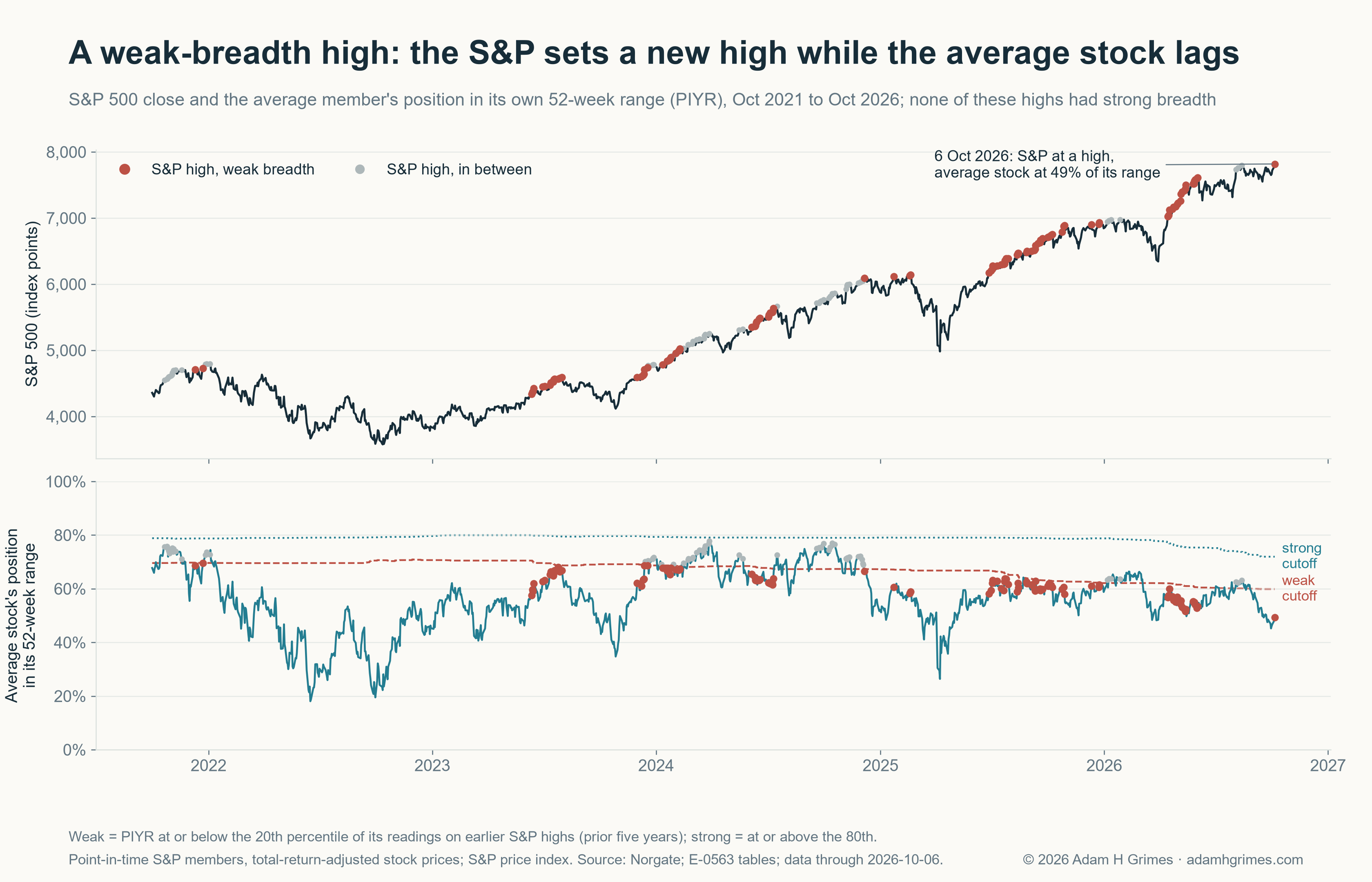
From these charts, something is very clear: major market declines are often preceded by poor breadth. This is true. But, more important, major, far-reaching advances also follow poor breadth. We might say that poor breadth has predicted ten out of the past three declines if we were inclined to be humorous. Acting on poor breadth (shorting indexes and/or decreasing long exposure) would not be a winning signal.
Why is this a "thing" in technical analysis? I cannot say for certain, but much of traditional TA is based on casual chart inspection. We tend to remember events that confirm our expectations, and we don't know (intuitively) how to weight outcomes. Seeing breadth divergence before market crashes can make us believe it to be a valid signal. Simply looking at a chart is not analysis. It's likely that any bias we have can be confirmed by looking at a chart. If we really want to understand the tendency, we have to ask the data some hard questions.
Here is one way to do this. The chart below takes every 52 week high in the index, and looks at (roughly) the return one quarter forward, for both weak and strong breadth readings. A chart like this also gives us a chance to compare other ways to measure breadth; it's entirely possible that some are better than others and might give better information.
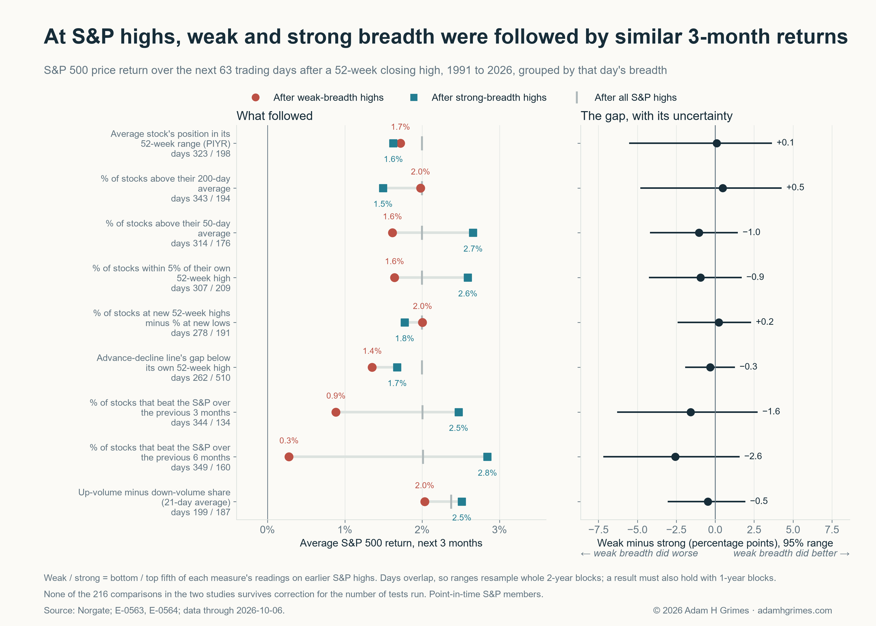
Interpreting this chart, the only measures that seem promising are measuring breadth by the % of stocks that outperformed the index over a previous window of time. Compared to other breadth measures, these do show wider spreads, and the spreads are in the "correct" direction. (Hold that thought, because we have another issue to consider with this measure in a moment.) Most importantly, the 95% uncertainty window for all of these includes zero, so the conclusion is that we cannot say these are non-zero effects.
Lagniappe: this is common in quantitative analysis, and is where some of the art lies, even in working with hard data. Statistical significance tests are real, and demand attention. Most trading ideas don't survive significance tests, and this means they probably won't be good for your P&L curve if you try to implement them. However, a persistent tilt, even if slight, may point to some element of market behavior that is worth further attention. One of the things that catches my eye is seeing signs align in the "correct" direction. Even if the effect is small and buried within noise, I may do further research and I may just find something useful.
I do often believe that much of what passes for traditional TA is just poor methodology, but, in this case, there's something else going on. And it matters.
Something Changed
When doing quant work or market analysis, there's always a debate about how much data to use. Should we go back hundreds of years if data exists for our market, or just use last week? The answer varies (shorter-timeframe trading probably favors more recent data), but we should be on the lookout for something shifting. Take a look at this chart:
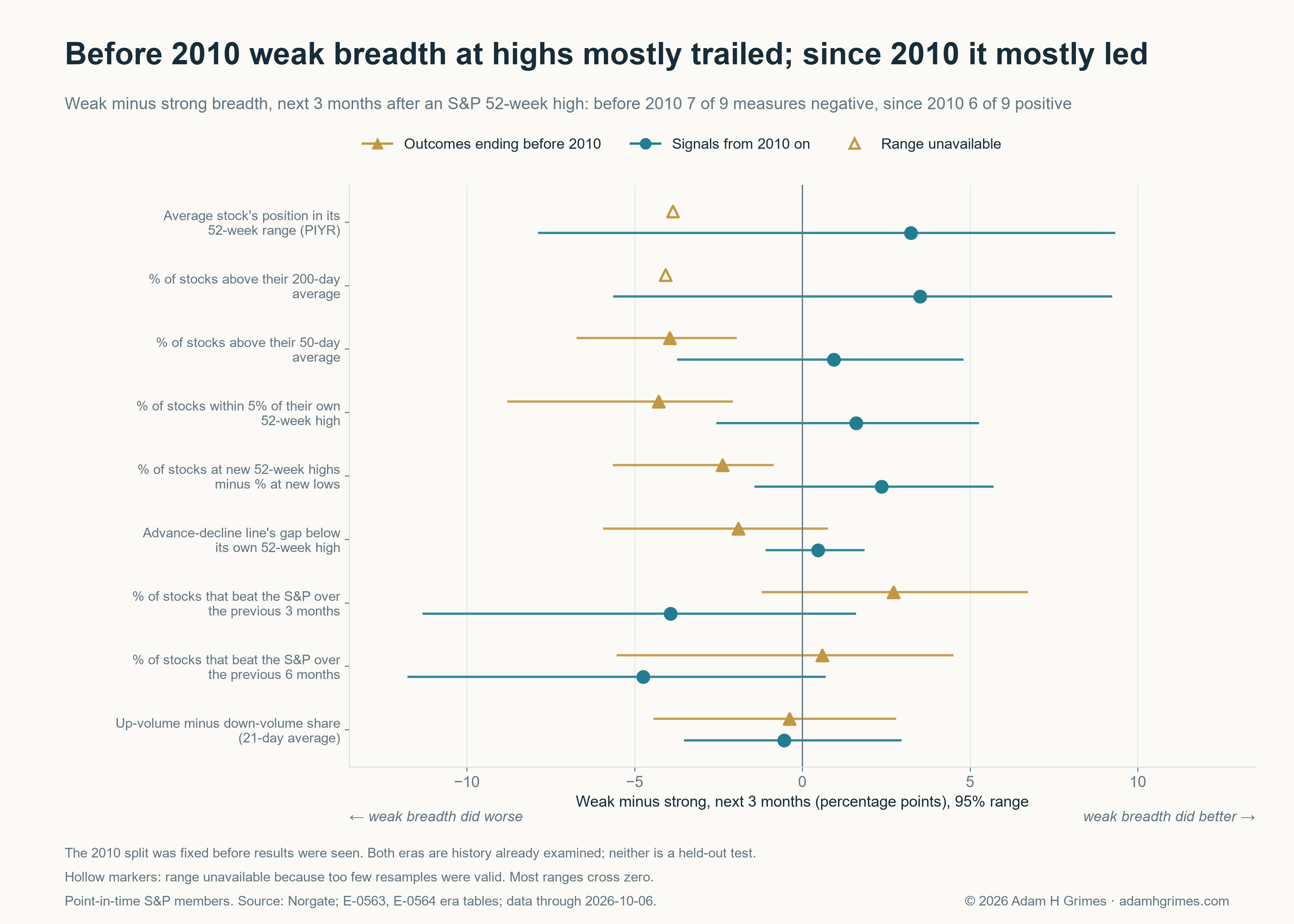
Sometime around 2010, something changed. We see this in several quantitative measures, but very clearly in this breadth work. Pre-2010, breadth worked more like we are told it should--weak breadth came before market declines. Post-2010, the story is completely different. Put these two together, and we get an effect that zeroes out.
Furthermore, our promising measures in the long dataset (percentage of stocks outperforming the index before the high), shows another interesting effect: it only works in the post-2010 era, having been on the wrong side pre-2010. If we are focusing on recent data (and I'd strongly argue we should be here), this is a measure that deserves more attention.
I think there's an argument to be made here for considering the opposing thesis: in this market, poor breadth may actually come before strength. Why? I'm now guessing, but I would suspect the explanations have to do with the very strong monetary support that has been under the market ever since the 2007-2009 financial crisis. Every dip has been bought, with reliability. Will that continue forever? That's the million dollar question.
What About Crashes?
It's possible that breadth might not show a tilt in quarterly returns, but could be meaningful at other horizons. (I tested this. It wasn't.) It's also possible that poor breadth sets up outsized declines, or comes reliably before market crashes.
The table that follows shows the percentage of times the S&P 500 fell at least 10% in the next quarter, after both weak and strong breadth measures. (Every day is measured, so the "separate events" column shows how many actual events we are measuring. There's no meaningful effect here.
| Breadth measure | Fell 10% within 3 months: after weak-breadth highs | after strong-breadth highs | Separate episodes behind those drops, weak / strong |
|---|---|---|---|
| Average stock's position in its 52-week range (PIYR) | 5.9% | 13.1% | 7 / 3 |
| % of stocks above their 200-day average | 5.2% | 13.9% | 6 / 3 |
| % of stocks above their 50-day average | 6.1% | 9.1% | 6 / 2 |
| % of stocks within 5% of their own 52-week high | 6.5% | 6.7% | 7 / 3 |
| % of stocks at new 52-week highs minus % at new lows | 6.1% | 8.4% | 7 / 5 |
| Advance-decline line's gap below its own 52-week high | 9.2% | 6.3% | 8 / 7 |
| % of stocks that beat the S&P over the previous 3 months | 11.0% | 5.2% | 6 / 2 |
| % of stocks that beat the S&P over the previous 6 months | 11.5% | 6.2% | 7 / 1 |
| Up-volume minus down-volume share (21-day average) | 5.5% | 7.0% | 3 / 4 |
Conclusions
So what can we really say here? Many commentators are currently forecasting a market crash. This is not news--commentators usually have no skin in the game from an actual trading perspective, so they can say anything. Screeching for a crash gets a little attention, and, in the unlikely event the market does crash, they can say they were right and sell newsletters telling people to buy gold. We all know how the game works.
But for those of us actually managing risk, I would suggest completely ignoring the ideas of "a narrow advance" or a market "running out of gas" as new highs are chiseled out on poor breadth. It's not a meaningful signal. Acting on the signal will lose money. Should we "just be aware of it"? Is more information always good?
Good information is good. Bad information will, at best, introduce subtle bias into our market analysis, often without us even know it. Nothing good will come of this. Breadth is a real measure that tells us something about how an index is moving, but the traditional interpretation does not survive scrutiny. Bad tools have no place in my toolbox. What about yours?
A note on the use of AI: I am a writer. The ideas, structure, words, and mistakes in this post are my own. I use AI as I would use a capable human editor--mainly for line editing and fact checking. I remain deeply committed to human creative work and am equally committed to using the tools that support this work. My market research combines hands-on analysis, discretionary inputs, my own quantitative testing suite (Pantheon), and AI assistance. Images accompanying these posts may be generated by AI.