Volatility Has a Memory
I'm going to be writing a series of posts over the next few months in which I will return to some core elements of market behavior. I'll show what can be quantified, but also leave the door open for discretionary interpretation. I suspect it's possible to operate successfully in financial markets with a minimum of discretion, but I don't think the reverse is true in the long term. I've seen many traders get in trouble when their discretionary inclinations are blind to quantitative realities. We need both.
I'll also try to share ideas here that, while foundational, are not basic. It's very difficult to write for audiences covering both developing traders and professionals, but I'm going to continue to try to do that! If something seems elementary, look deeper.
Today, I want to start by looking at the behavior of volatility itself in a specific financial market, the S&P index futures. I'm using this market because it is a liquid market that is a favorite of many traders, but also because the observations generalize to other markets pretty well.
How Volatility Is Different
Some elements of market behavior are simple, observable facts: prices moved a certain amount. Yes, we can measure in percents or other units, but there's no denying that price moved from one number to the other. (The decision to measure over time periods is a decision, though. While daily measures seem obvious, it is theoretically possible to do something like a 24 hour or a 6 day interval.) Another objective measure is that a certain number of shares or contracts changed hands (volume) in a certain amount of time.
Volatility is different. Volatility is a way of quantifying how quickly price changed, but it cannot be directly measured. It is not a raw market observation in the sense that price or volume might be. It is a constructed measure. This means that every observation of volatility is both a measure of what we're hoping to measure, and of the specific way we decided to measure it.
There are, broadly speaking, two categories of measures. The first focuses on a single price from a time period. A common example of this is to use closing or settlement prices for a market each trading day. This is the standard approach in many models, and it's possible to calculate standard deviations of returns (percent changes) or other measures from these samples.
The other choice focuses on the range that prices covered during a period. In any trading day, prices sometimes cover a wide range, and other days stay close to one value.
It's interesting that many volatility estimators focus only on closing prices, and the close-to-close framework is what supports many traditional derivatives models. These measures are blind to intraday range, which may or may not matter for risk. On the other hand, traders using technical analysis software often focus exclusively on range-based measures, which don't really consider closing prices (beyond the fact that the close must be somewhere in the day's range.) There are tradeoffs between all of these options, and it's important to understand any tool we use.
ATR: Average True Range
Calculating range is easy. (Let's assume daily bars or candles for this post.) Subtracting the low from the high gives the range for any time period.
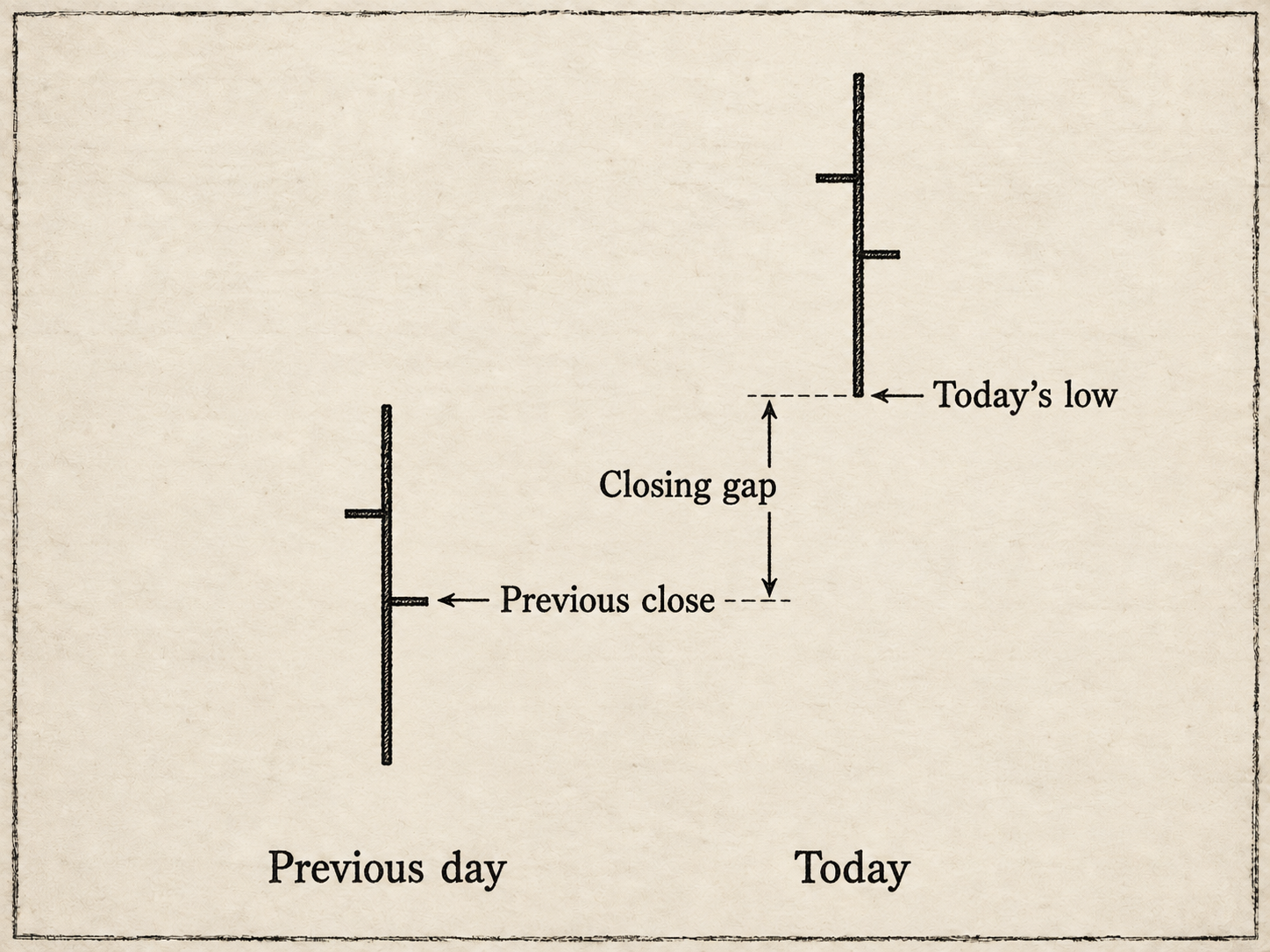
However, consider the chart above. The market gapped up on the open, and the low of the day stayed above the previous close. The range for the day does not include that space below the low and previous close. However, any trader holding overnight would have been exposed to the move from the close to the open; the market did make that move. Prices actually covered the entire range from the previous day's close to the high of the last day on the chart. We need to add that back in.
This is True Range: the daily range (H-L) plus any gap from the previous close to the high or low of the day's bar. We are "adding back" the overnight gap to create true range. Formally:
True Range = maximum(H − L, absolute value(H − C₋₁), absolute value(L − C₋₁))
Should you use simple range or true range? The benefit of simple range is that it is, indeed, simple--can't argue with high-low. The argument for true range is that, again, the market did make the overnight move and discarding it understates volatility. In general, we find true range to be the preferable calculation.
There's also an easter egg in true range: If you're using a market that has a daily range of zero, range-based calculations will give you zero. However, zero is not actually reflective of price changes and volatility. True range "automatically" captures the overnight price change. (You might ask when you would need this. Two common examples are further-out months for commodities which may print only a settlement price some days, and economic measures such as interest rates which are only a daily fix.)
You might have noticed there's another word in ATR: average. To calculate the average true range, we simply take the mean of true range over a time period. Welles Wilder Jr's initial calculation involved an exponential moving average that was easy to calculate on paper, but, frankly, makes absolutely no sense to me today. I want to know I'm measuring volatility over a specific time period. If you are comparing my measures to software using the original calculation, you'll see a difference.
But what time period? That's a good and non-trivial question. Shorter measures are noisier, but they respond more quickly to changes. Longer measures reflect longer-term averages. Technical analysis software often defaults to ATR(14), for no good reason other than this was what the early formulations of the tool used. I tend to use 20, which is roughly the number of trading days in a month. Five is another option to consider (a trading week), and 60 or 252 (a quarter or a year, for daily data) are choices for longer-term averages.
One other thing you might want to consider is whether or not you wrap the current day's action in if you're evaluating today's bar in relation to the baseline. I find it's often preferable to compare today's day to the baseline calculated on the close of the previous bar. Otherwise, extreme events are tamped down because they are being compared to themselves in the average.
Why We Care--A Roadmap
Trading and market analysis is a discipline of understanding change. Before we can hope to understand how things change (and perhaps make some predictions about how they might change in the future), we must be able to measure well! Rather than just accepting wiggly lines on your screen and trying to imagine what they might say in the future, a little bit of time spent thinking deeply about details might help to build a stronger foundation.
Volatility has a memory. In fact, the best simple forecast of tomorrow's volatility, despite the (literally) many thousands of volatility forecasting models, is today's volatility. At the very least, this is a useful starting point: The future is likely to look like the past. Until it doesn't. And when it doesn't, that might really matter. Fortunes are made and lost in those disconnects.
When disconnects occur, it's often because "the stuff" has really hit the fan--some outside shock has hit the market to produce a large move. Assuming tomorrow will look like today might very well get you through all but a handful of days in a year, but those few days can be catastrophic in the same way a rare storm at sea might swamp an oceangoing ship. Volatility spikes, and sometimes it spikes hard.
Volatility also has a longer-term baseline. When volatility gets away from that baseline, a tug of war ensues between "tomorrow looking like today" and the pull back to that baseline. Huge shocks in volatility tend to revert back toward that baseline. Yes, the baseline can change, and sometimes can be distorted for a while, but this pull back to the "norm" is another compelling force.
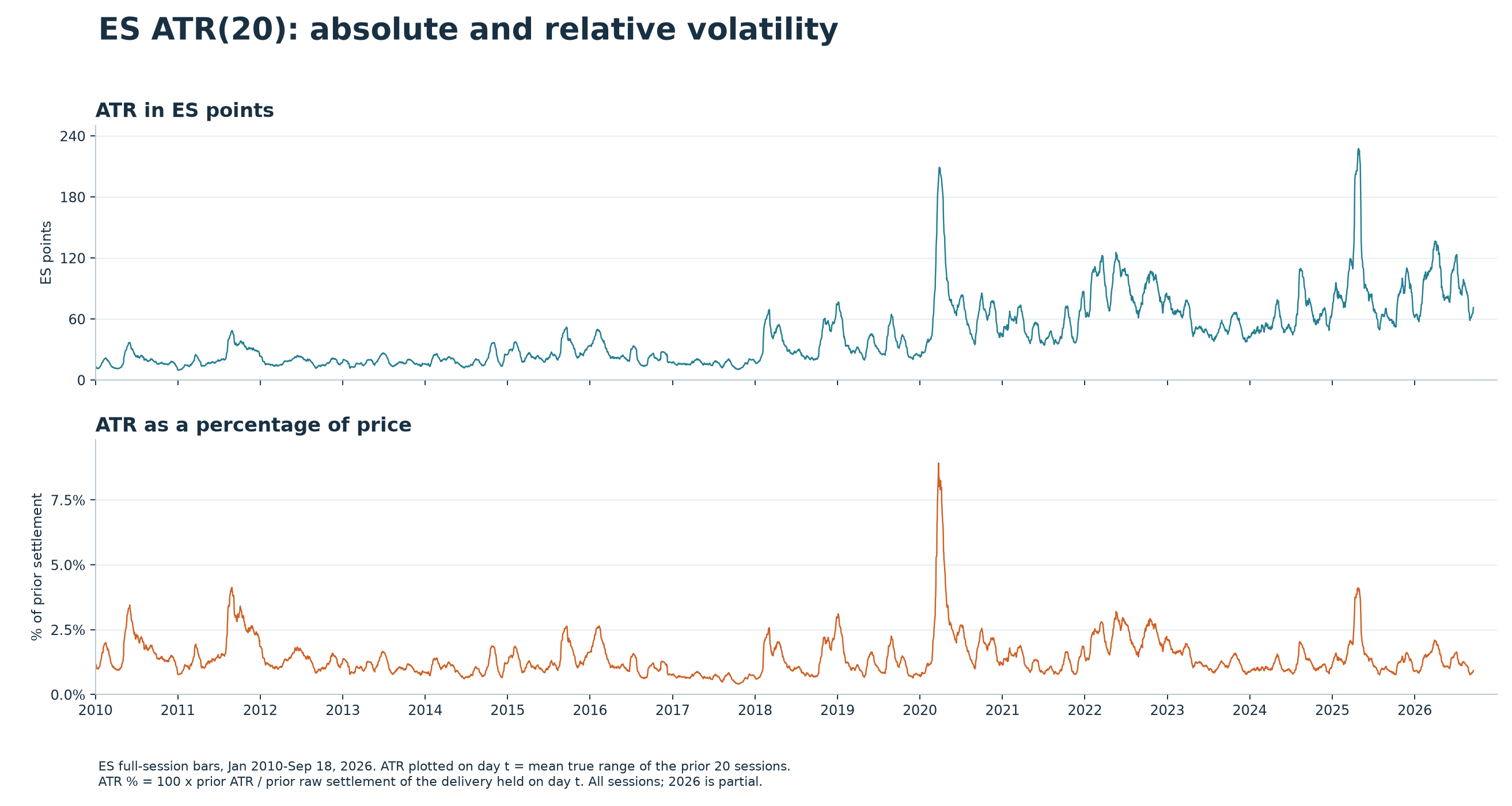
Of course, this is just a rough sketch, but it's a sketch that is backed by academic research, the behavior of real data, and my own observations over a career of several decades in the markets. Take a look at the graphic above, which shows the ATR of the S&P 500 futures, in both points and as a percent of price. The percentage measure is useful because the price of the index has increased substantially over the years--seeing the average point value of the day's range trending higher is nothing more than seeing the baseline price drift higher.
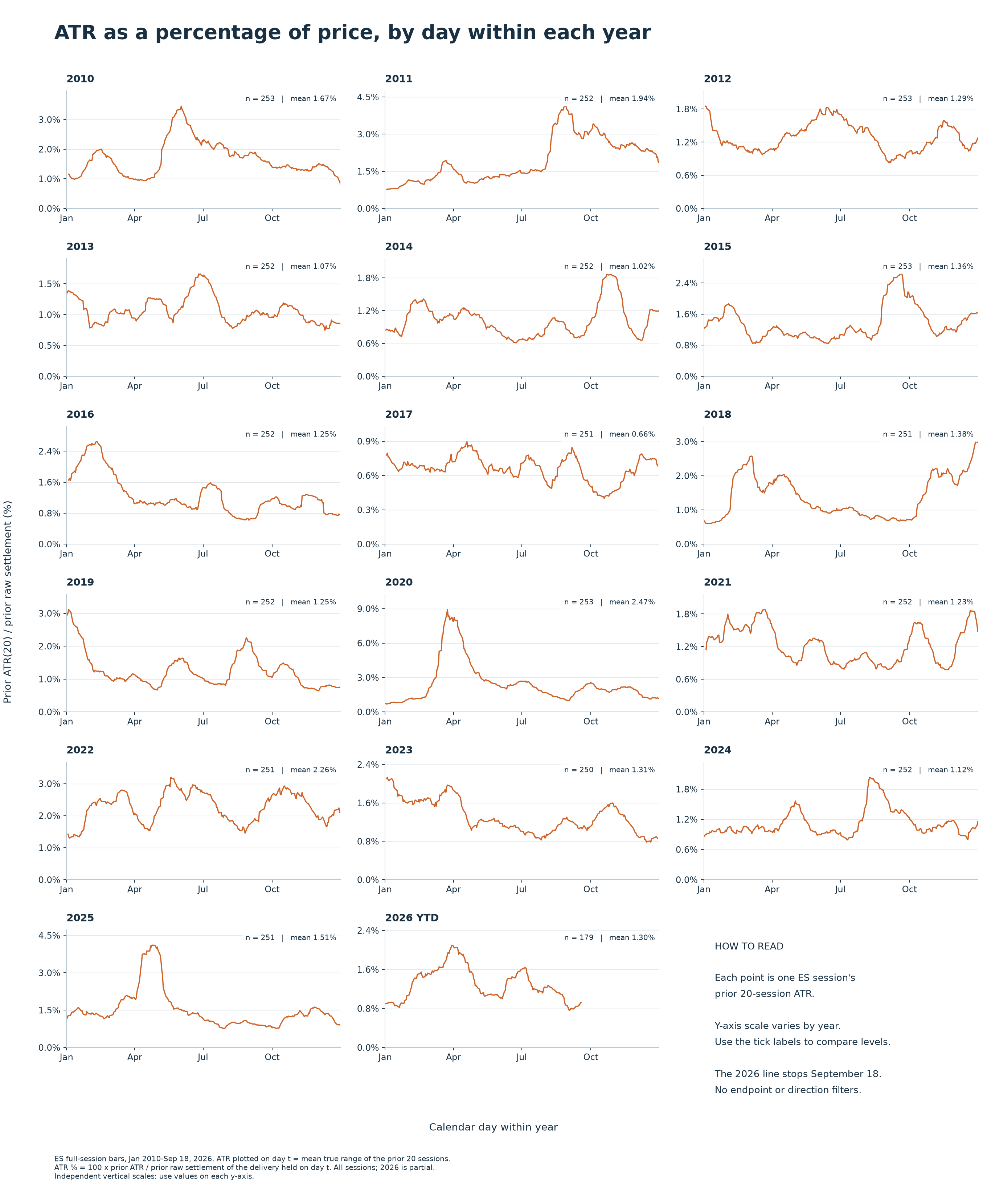
Here is the same data, but spread out into panels for every year since 2010. Remember, this measure of volatility is 20 period ATR--the average daily true range over approximately a month's time. It can be useful to see how volatility evolves over the course of a year. This zoomed-in view for each year gives a sense of how volatility evolves. Of course, any historical lookback collapses many historical events into a single line, but this is the price we pay for perspective.
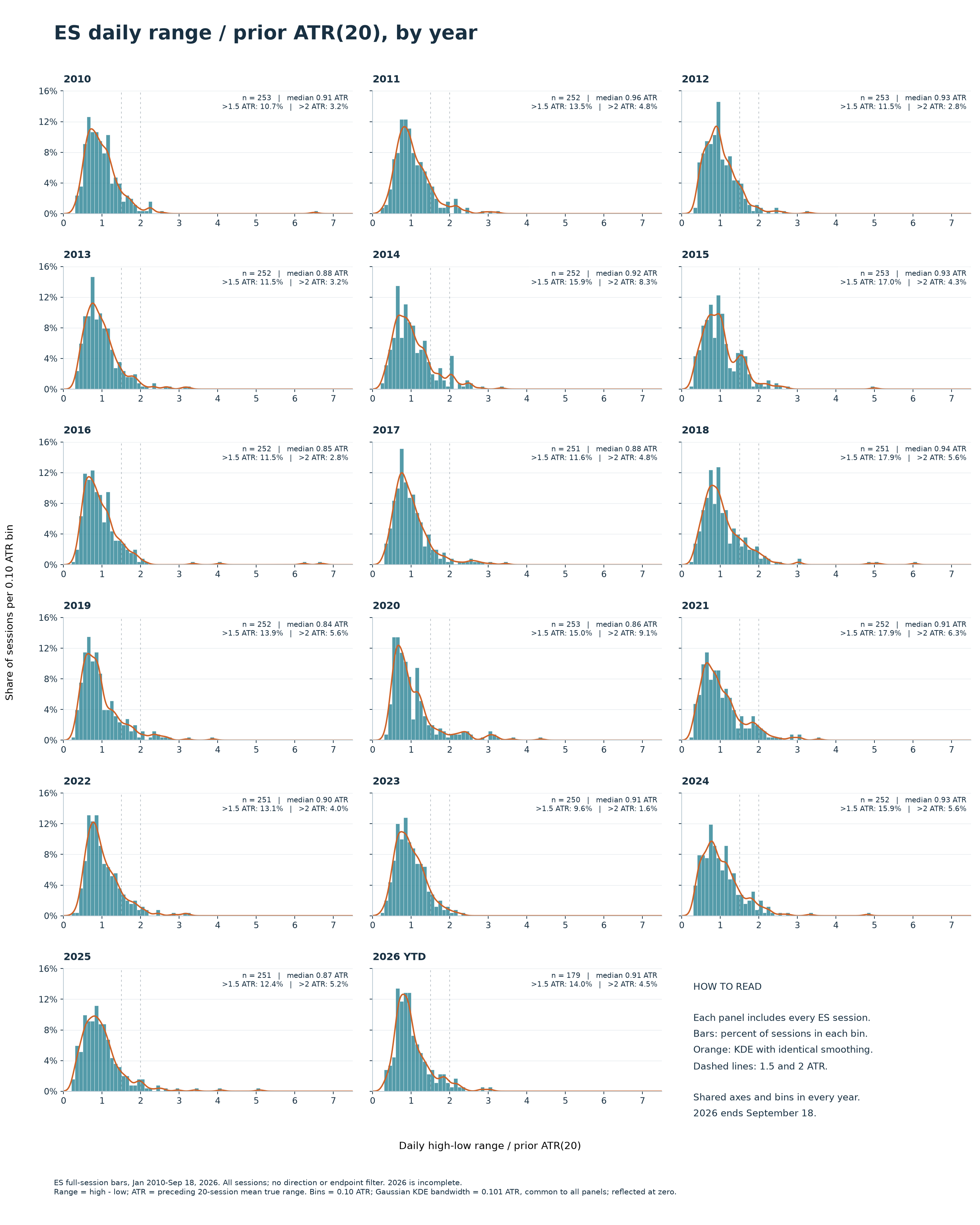
Allow me two more sets of charts. For some reason, these types of charts are much less common in technical analysis circles and books, but they are standard for any actual data analysis work. A histogram shows the distribution of volatility, in this case, separated into panels for each year--a critical perspective when we want to understand what is usual for a dataset, what is extreme, and "just how extreme have things been in the past?"
Why is this perspective unusual for technical analysis? I don't know, but I've speculated that technical traders who focus on chart patterns have no idea what to do with information like this. If we're only focused on wedges or breakouts, quantifying volatility using a histogram might not seem to be that useful. I also wonder if it was difficult for early computer systems to do this and to display it easily. The early charting packages focused exclusively on a time-based price axis. When producing a histogram, there are choices involved (number of bins, what to do with outliers) and producing a histogram is a bit more computationally intensive than averaging. If you haven't used histograms, I'd suggest you start exploring them.
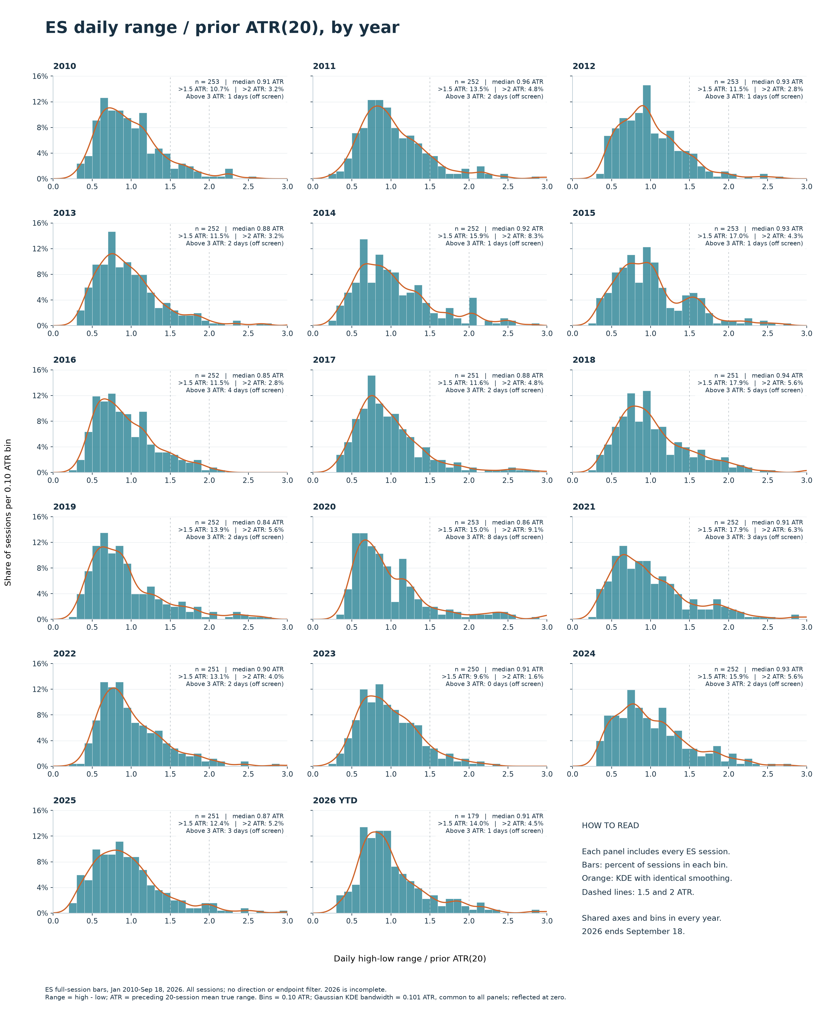
And here's the last chart--the same histograms, but with the tails removed. This lets you zoom in on the "meat" of the yearly distributions. All of this work has been exploratory. Volatility is associated with exogenous events--news and new information hitting a market--but other factors (including feedback loops) can lead to volatility explosions. There are some important lessons visible even here at the beginning: volatility tends to look like yesterday's volatility, until it doesn't. Volatility can have extreme spikes. Those extreme spikes are usually resolved quickly, unless they aren't. And those "unlesses" and "untils" are doing a lot of work.
What can we do with this? I'll follow up with a blog soon digging into some more details of how volatility evolves, develops and changes, with some forecasting ideas that may help find trades and manage risk.