Chart Reading Isn’t About What’s Right. It’s About What Works
What’s the right way to read chart structure? That’s the wrong question. This post explains why context and utility matter more than correctness in trading charts.
Here is a smart, practical question we got this week from one of our MarketLife members who goes by the handle kaiser:
I'm still struggling with how to correctly identify extension legs and retracements. I’ve attached two versions of the same chart to illustrate my confusion:
So here’s the core of my question: Which interpretation is correct—and why? I’m inclined to prefer the blue version, because previous legs already had their own retracements. So I don’t understand why I should consider a leg that has already retraced to be part of a new extension?
I’d really appreciate a clear guideline on how to define these legs more consistently. thank you
What is right? What is useful?
This is a good question, and it’s one that cuts right to the heart of chart analysis: all swings, on any chart, can always be decomposed into smaller and smaller swings. Of course, it works the other way too—any swing is part of a larger structure too.
Many of you are nodding and skimming at this point, thinking something like “oh, he’s talking about multiple timeframe analysis I know this.” Are you sure? Yes, this is the way we typically teach it—a swing on a 15 minute chart resolves into a structure on the hourly, or we can zoom into a weekly structure and find patterns on the daily that are significant. This is one way to do it, but it relies on the arbitrary division of bars and candles. One might argue it’s not really real.
You probably don’t need all those charts.
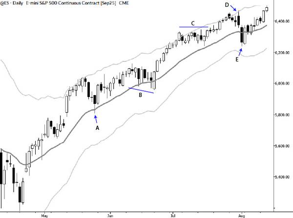
But what this question points out is something a bit deeper. Even looking at a single timeframe chart, we can see structure within bigger moves, and it’s a bit of a judgment call how finely to dice it. In fact, we could easily produce at least two or three more charts with other degrees of resolution. Which one is right, kaiser asks?
Well, I would argue that’s not the right question. They are all “right” if they are done correctly. I could not take issue with either of his chart interpretations. The question is not which are right. The question is: which is most useful?
The questions that matter
And this cuts right to the heart of how I see and use charts. The whole point is to understand what a structure “means” and “what it is trying to do.” I think of this as functional analysis (a term I probably subconsciously stole from the theory of musical analysis.) When I look at a chart, I run through a thought process that looks like this:
- First, is there any point in looking at this chart? Is it in equilibrium, in which case it will likely move mostly randomly and unpredictably. Or is there some reason to think we might have a directional edge?
- If there might be an edge, which side (buyers or sellers) is in control? How firm is their control? How do I know? How will I know if they lose?
- What are they trying to do? Another way to ask this is to ask how will I know if that group wins?
This is far more valuable than parsing the details of any price move. I’ve received innumerable questions over the years asking details of indicator settings, pivot points, trendlines, and other tools. Other authors have written millions of words on the precise (and mostly meaningless, frankly) details of individual bars.
There’s information here, but it pales before a bigger picture understanding of context, dominance, and direction. Once you have that context, then you can zoom in on those details, and some of them might even be very important.
My answer
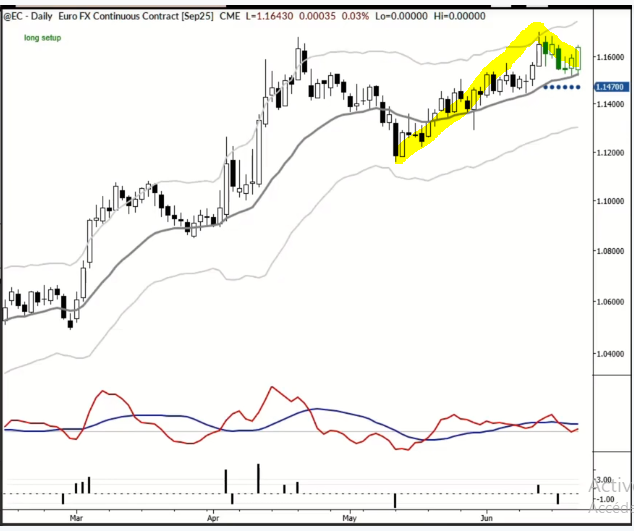
In this particular case, I find the yellow structure to be much more compelling. It shows what is happening on the timeframe and magnitude that are meaningful to a trade I might set up: sellers lost back at the beginning of May and the market has been rallying ever since. (Here, I sweep all the blue swings aside—they are noise at this level.) We tested the highs (which coincided with the upper Keltner channel), and then backed off a bit. But, critically, we didn’t back off very far. This certainly has the look of price acceptance (instead of rejection) and strongly suggests continued upside.
It's also worth pointing out that this chart is a few days old. This morning, Tom and I took profits on the long trade that set up based on this yellow pattern.
It’s vitally important that you work to understand the big picture. Too many times, too many traders focus on minutia, thinking that hard work on the details must be repaid with profits. The real answers come from putting those details into context, understanding what the market is doing and why, and working to align with the current dominant forces in the market.
This is how profits are made—not by perfect structure, not by getting every detail right, but by aligning with the flow.